Why white space is important in design?
If you've ever worked on design projects for clients, you might have encountered feedback about excessive white space in your designs. Does this sound familiar? Excessive empty space is often one of the most common comments from clients. But why is that?
To an untrained eye, white space may seem useless. Unfortunately, many clients perceive it as wasted valuable space. They prefer filling it with content or additional design elements to make it more visually striking.
There are a couple of reasons why you might receive this feedback. It could be that the client is overly scrutinizing the design, or it could be that the white space is not utilized effectively, resulting in an unbalanced appearance.
In this article, we will explore the importance of white space and discuss various ways to use it effectively. Additionally, we will showcase some visually appealing examples of white space in web design and delve into why they are successful.

What is whitespace?
Whitespace, also known as negative space, is a fundamental concept in design. Despite its name, whitespace doesn't necessarily have to be white and can be of any color. It refers to the empty areas devoid of visual elements, such as shapes, text, or images, similar to the invisible air that surrounds us.
Whitespace is ubiquitous in the design world, appearing on websites, book pages, and food packaging labels. It is often so seamlessly integrated that it goes unnoticed. However, that is precisely its purpose.
Unlike other design elements, whitespace is invisible. Its primary function is to separate and accentuate other design elements. Yet, there are instances where whitespace becomes dominant, intentionally drawing attention due to its symbolic significance within a design.
As a designer, you are likely familiar with whitespace and its application in design. However, did you know that there are two distinct types of whitespace?
Micro whitespace
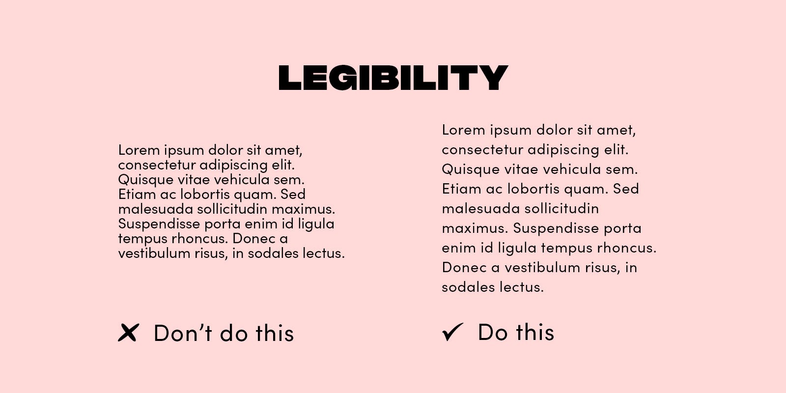
Micro whitespace, as the name implies, pertains to small areas of empty space within a design. It encompasses the spacing between letters, lines of text, and grid images. Micro whitespace serves a crucial role in enhancing legibility and preventing visual elements within a grid or pattern from appearing cluttered. For instance, when creating a web-based photo gallery, micro whitespace is essential for visually differentiating individual photos, preventing them from merging into a single, perplexing image.

Micro whitespace between words and lines of text is indicated here with arrows.
Macro whitespace
Macro whitespace, conversely, denotes more extensive expanses of empty space within a design. When discussing whitespace in design, this is often the aspect that comes to mind. Instances of macro whitespace include the margins on the sides of a blog post and the gap between a logo and the menu in a top navigation bar.
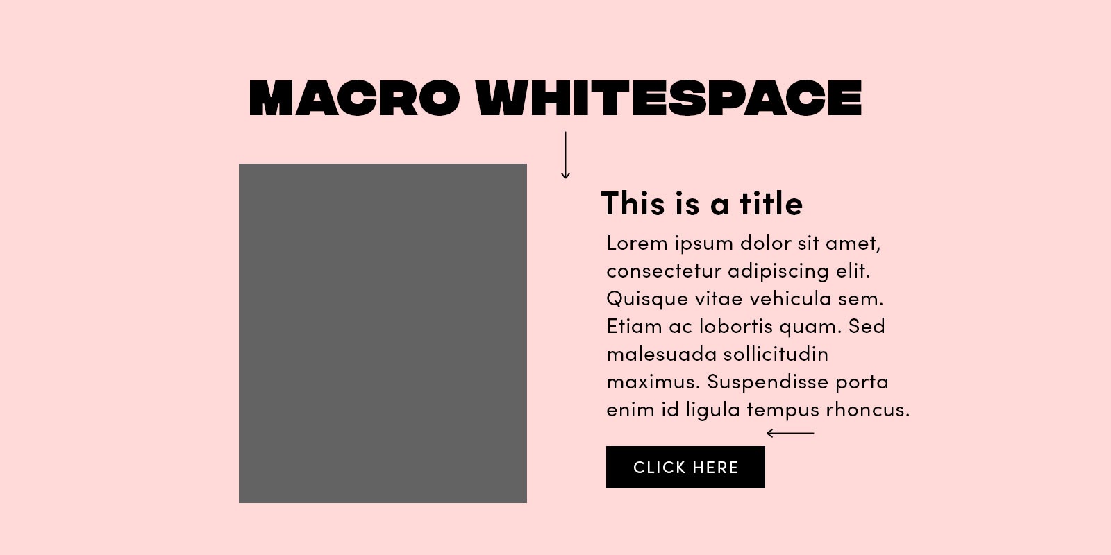
In this example, macro whitespace separates the shape from the text and the text from the button.
Why is whitespace important in visual design?
As mentioned earlier, the significance of whitespace in design may not be immediately apparent, particularly to non-designers. However, whitespace indeed fulfills several crucial functions within a design. Let's explore a few reasons why white space is essential for achieving good design.
Legibility
When letters are excessively crowded or excessively spaced apart, readability can be greatly compromised. This is where micro whitespace comes into play. While there are no strict rules for letter and line spacing, if reading requires extra effort, it is necessary to adjust the spacing accordingly.
Clarity
In the absence of whitespace to distinguish elements, a design can become visually perplexing. When it's unclear which elements are interconnected and which are not, users may have a negative experience. To ensure user satisfaction, incorporating whitespace is crucial as it assists users in focusing on one element at a time, resulting in a more pleasant user experience.
Harmony
A design that fails to utilize whitespace effectively, or lacks it entirely, can give off an impression of disharmony. Harmony is crucial in design as it fosters a sense of unity and completeness. While multiple factors contribute to achieving harmony, whitespace plays a significant role in this endeavor.

In conclusion, the feedback about excessive empty space in design is a common occurrence for designers. Clients may perceive whitespace as a waste of valuable real estate and prefer to fill it with content or design elements. However, whitespace serves important functions in design. Whitespace, whether in the form of micro or macro whitespace, plays a crucial role in enhancing legibility, providing clarity, and establishing harmony within a design. It ensures that letters and text are easily readable, prevents confusion by separating elements, and contributes to a sense of unity and completeness. As designers, it's important to understand and utilize whitespace effectively to create visually appealing and user-friendly designs. By embracing the power of whitespace, we can enhance the overall aesthetics, readability, and user experience in our designs.